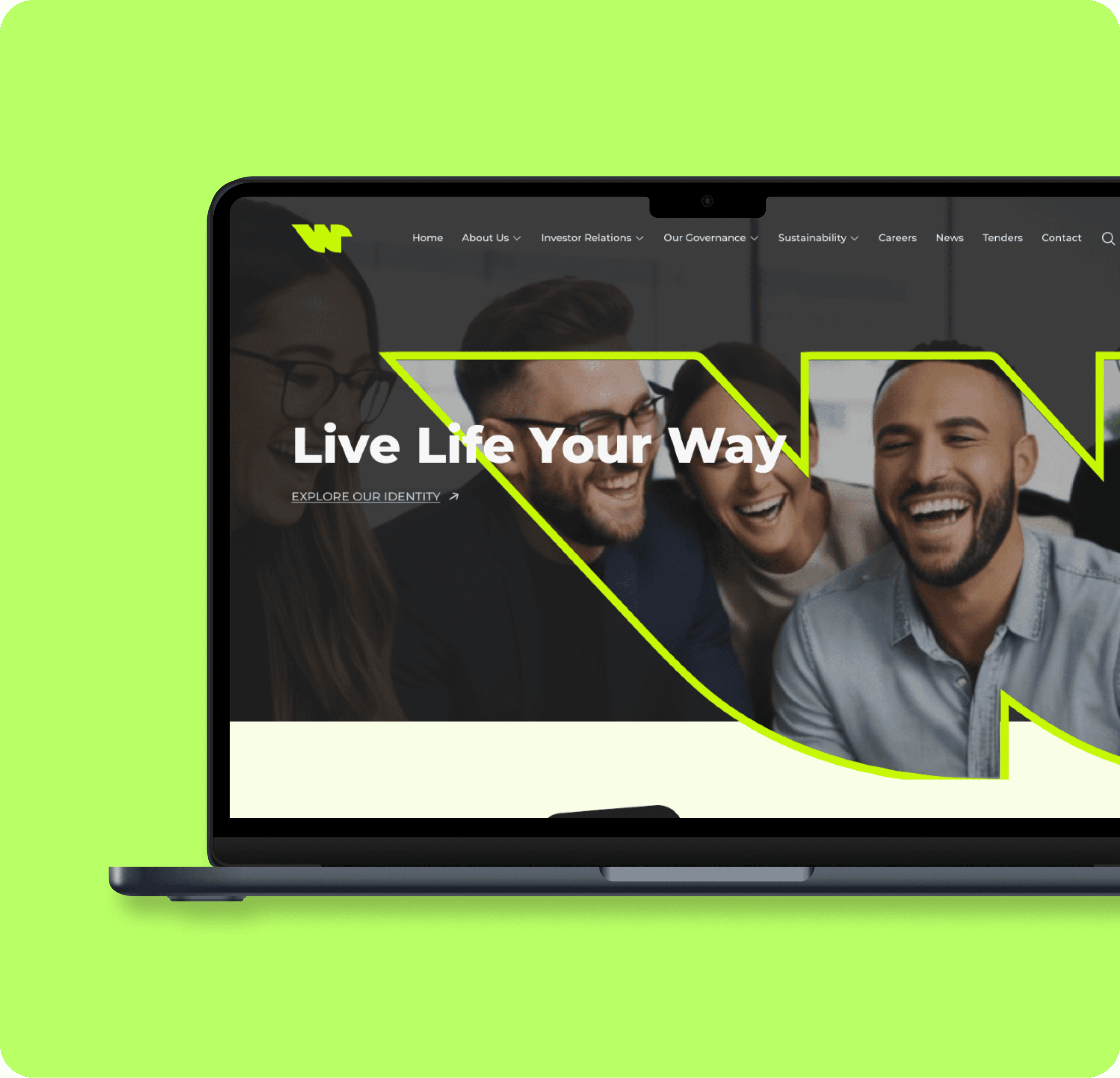
Wham* Website Revamp

Wham* Website Revamp

Wham* Website Revamp

Wham* Website Revamp

Modernized website! We will walk through how the team address goals & challenges to improve user experience.

Modernized website! We will walk through how the team address goals & challenges to improve user experience.

Web Design

UI Designer

Yr. 2024

*Not actual name of company due to signed NDA

*Not actual name of company due to signed NDA

Defining the problems

Defining the problems

A complete redesign is needed to modernize the look, improve usability, and create a more engaging experience.

A complete redesign is needed to modernize the look, improve usability, and create a more engaging experience.

Outdated Design

The current UI lacks visual appeal and fails to capture user attention.

The current UI lacks visual appeal and fails to capture user attention.

The current UI lacks visual appeal and fails to capture user attention.

The current UI lacks visual appeal and fails to capture user attention.

Missing CTAs

Unclear call-to-action elements lead to user confusion and hinder navigation.

Poor User Experience

These issues combine to create a negative user experience, necessitating a UI redesign.

These issues combine to create a negative user experience, necessitating a UI redesign.

These issues combine to create a negative user experience, necessitating a UI redesign.

Youth Disconnect

The aesthetic doesn't resonate with the target demographic, resulting in low engagement and retention.

Research

Research

Competitive Analysis: We focused on the features and the different UIs of the top competitors to identify their strengths and weaknesses.

Competitive Analysis: We focused on the features and the different UIs of the top competitors to identify their strengths and weaknesses.

Market Trends: Mention any relevant trends in UI design that were considered.

Market Trends: Mention any relevant trends in UI design that were considered.

User Interview: To gain deeper user insights, we conducted short interviews to explore user needs and gather feedback on their pain points.

User Interview: To gain deeper user insights, we conducted short interviews to explore user needs and gather feedback on their pain points.

Design Process

Design Process

Information Architecture (IA): We'll map out how content and features are organized for a clear and intuitive user experience.

Information Architecture (IA): We'll map out how content and features are organized for a clear and intuitive user experience.

Wireframing & Prototyping: We'll start with basic layouts (wireframes) to define the user flow, then build interactive prototypes for user testing and refinement.

Wireframing & Prototyping: We'll start with basic layouts (wireframes) to define the user flow, then build interactive prototypes for user testing and refinement.

Visual Design: We'll create the interface's visual style, considering branding, user preferences, and usability principles like typography, color schemes, and imagery.

Visual Design: We'll create the interface's visual style, considering branding, user preferences, and usability principles like typography, color schemes, and imagery.

Key UI Improvement

Key UI Improvement

Sleek and Modern Design

Experience a visually stunning interface that is both sleek and modern, elevating the overall look and feel of the website.

Enhanced User Experience

Navigate through the revamped website effortlessly with improved user experience and intuitive navigation.

Responsiveness

Enjoy seamless browsing on any device with a fully responsive and mobile-friendly design.

Content Clarity

Discover information easily with a streamlined content organization that ensures a smooth browsing experience.

Wham* Final Reveal

Wham* Final Reveal

Wham* Final Reveal

Wham* Final Reveal

Design Rationale

Design Rationale

Design Rationale

The goal was to modernize the website, making it more engaging and user-friendly.

Color Scheme

Color Scheme

Bold colors against dark backgrounds for striking contrast and emphasis on key elements.

Color Scheme

Bold colors against dark backgrounds for striking contrast and emphasis on key elements.

Typography

Modern sans-serif fonts with varied sizes and weights for clear hierarchy and contemporary look.

Typography

Modern sans-serif fonts with varied sizes and weights for clear hierarchy and contemporary look.

Imagery

High-quality, relatable images with asymmetrical shapes for engagement and modern appeal.

Imagery

High-quality, relatable images with asymmetrical shapes for engagement and modern appeal.

Layout and Grid System

Dynamic grid system for enhanced visual flow and natural user navigation.

Layout and Grid System

Dynamic grid system for enhanced visual flow and natural user navigation.

Call to Action(s)

Large, colorful buttons to boost user interaction and facilitate navigation.

Call to Action(s)

Large, colorful buttons to boost user interaction and facilitate navigation.

Potential Outcome & Impact

Potential Outcome & Impact

Potential Outcome & Impact

❁ Improved User Engagement

Higher interaction rates and longer time spent on site due to engaging visuals and bold CTAs.

❁ Enhanced Brand Perception

Modern, professional image and better user experience increase user satisfaction and reputation.

❁ Increased Conversion Rates

Prominent CTAs boost conversions; responsive, user-friendly design ensures a positive experience on all devices.